Shakespeare Unauthorized Exhibition Design

Shakespeare Unauthorized
An exhibit at The Boston Public Library, showcasing the library's comprehensive collections of Shakespeare. This exhibit not only celebrates Shakespeare's large influence in English literature, it also raises important questions about Shakespeare's biography, writing process, collaborations, even the possibilities of forgeries.
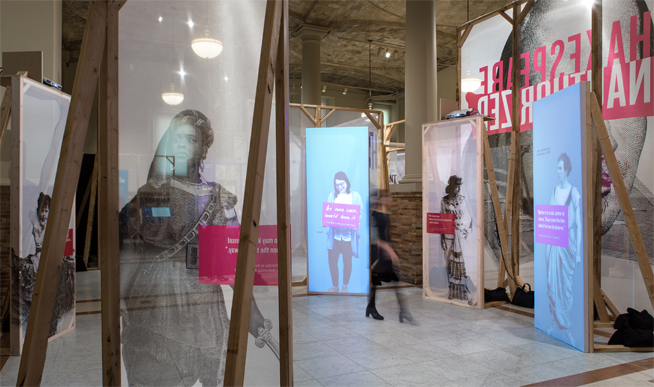
The construction of the space is inspired by stage set: modular wooden frames of equal sizes and printed translucent scrims. The overall look is raw and unfinished, as if we are at a backstage of a play.


One of the most intriguing questions with regards to Shakespeare's biography is the spelling of his last name. Many different spellings have been recorded throughout history. One of the most popular one is "Shakspere". The use of this different spelling gives viewers the impression of a misspelling, adding an additional layer of questioning and intrigue.

Theater in the Rounds Installation
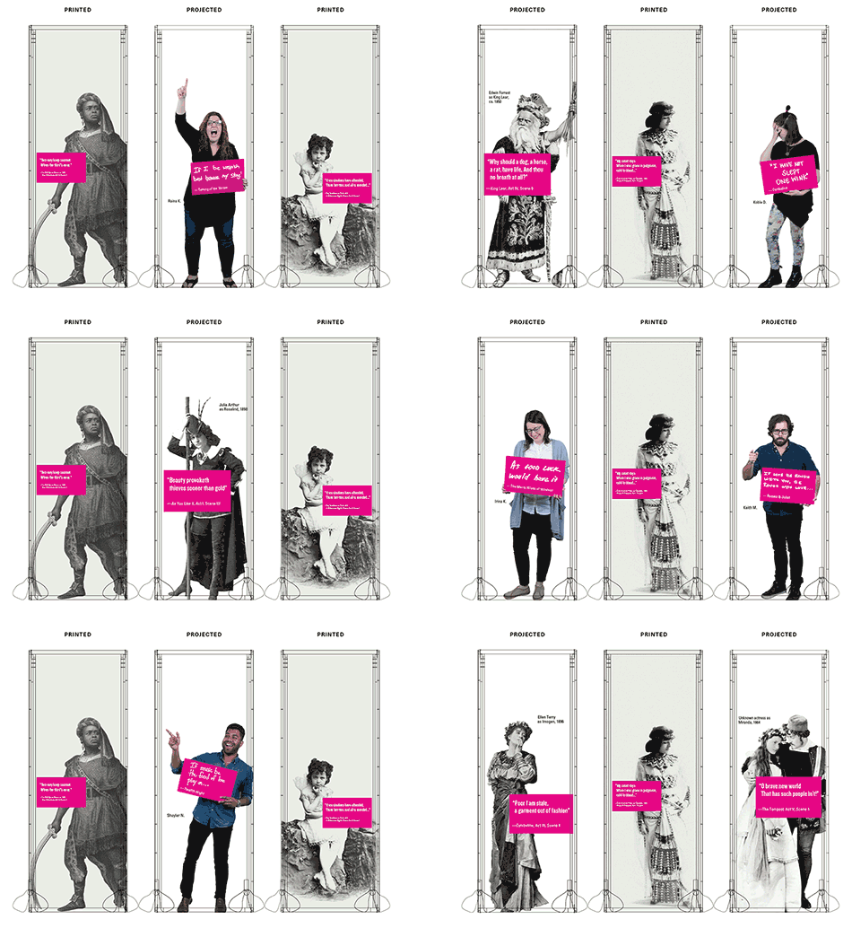
This projection piece aims to highlight the many famous Shakespearean characters and quotes. The addition of contemporary visitors' images, with their favorite quotes, to the collection of historical images emphasizes the relevance of Shakespeare's writings to contemporary audience.
Image above: "Theater in the Rounds" projection concept illustration.


Color and large typography are used to visually distinguish the different zones within the exhibit. We worked closely with the curator to come up with words and phrases that represent each section and make the physical constraints of the wooden frames work to our advantage. The results are titles of differing sizes, the size hints at the significance of the section within the exhibit.


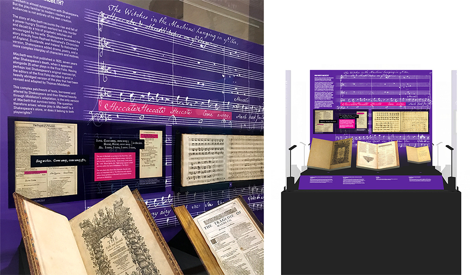
Magenta is used very specifically in the other exhibit's graphics to highlight key phrases on real-size reproductions. These highlighted texts appear in Magenta type on black when blown up. Example above: interpretive graphic comparing the 2 different words, Indian and Judean, that appears in different editions of Othello.

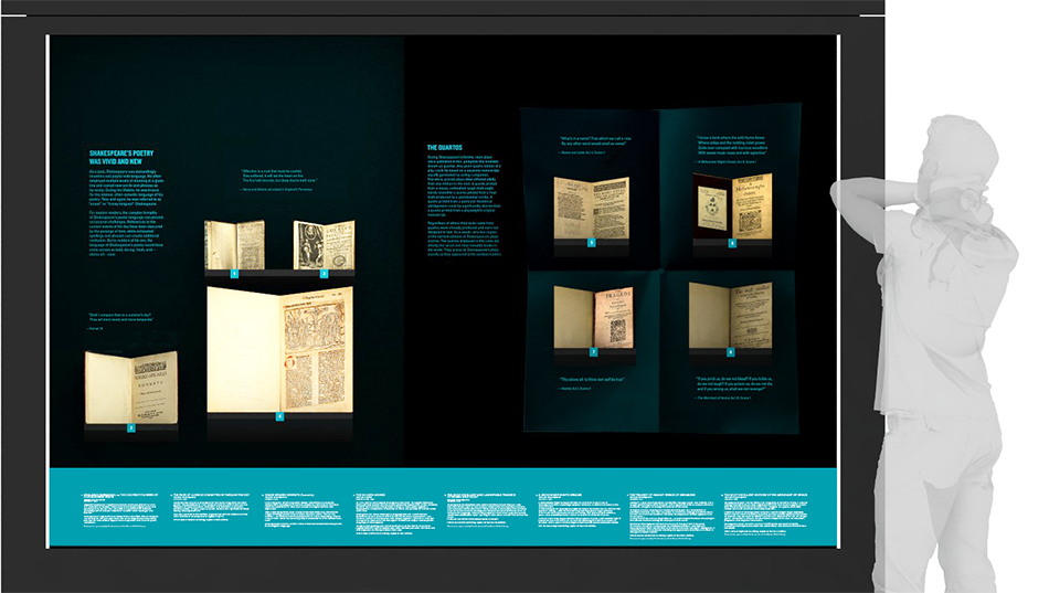
A rendering of one of the larger cases showing a selection of poetry and 4 early Quartos.


Presented during the exhibit are 2 touch screens. These interactive pieces allow the audience to get a more close-up views of the historical books on display. They also emphasized the Library's effort in digitizing its special and rare books collection.

All promotional and print collateral pieces for this exhibit were designed by C&G Partners.
Role: Lead Graphic designer and graphic production designer, exhibit concept development, co-content & project manager (with Dan Fouad).
Additional role: Promotional and print design and production lead.
Curator: Jay Moschella, Boston Public Library. Exhibit Development: Beth Prindle and Meghan Weeks, Boston Public Library.
Managing Partner: Jonathan Alger. Senior Exhibit Designer/Architect: Dan Fouad.
Motion Graphic: Min Kang. Junior Designer: Sukeshi Dalmia. Interactive Touchscreen: Brian James.
Fabricator: RH Guest, NY.
Exhibit Photography: Chuck Choi.
Work done at C&G Partners, NY. Year: 2016.
Boston Public Library exhibit page